
Wednesday, December 10, 2014
Tuesday, December 2, 2014
Blog Assignment #10

The map displayed here is one of possible sinkhole locations across the United States as of 1972. The karst landscapes shown here by two different colors make up the first variable while the lines for shading make up the second variable representing evaporite rocks that are known to be in an area.
Collected from:
http://ga.water.usgs.gov/edu/earthgwsinkholes.html
Blog Assignment #9

One dot represents one McDonald's. Interesting how many we have in the United States.
Collected from:
https://feszgis.wordpress.com/2012/02/06/mapping-density/

Blog Assignment #7
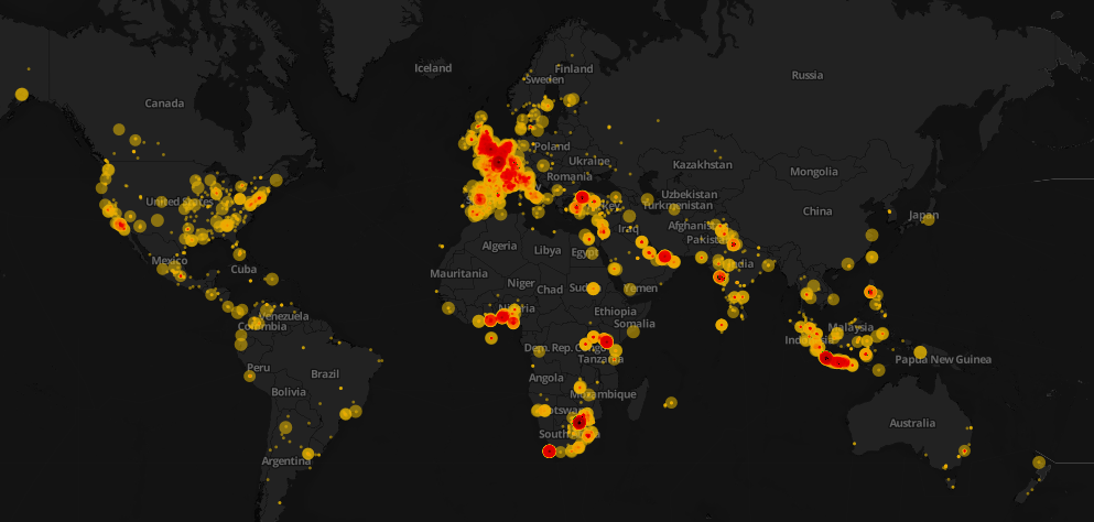
This Proportional symbol map is the worlds tweets of Nelson Mandela's death.
Collected from:
http://schoolofdata.org/tag/mapping/
Tuesday, November 18, 2014

Tuesday, November 11, 2014

Monday, November 3, 2014
Project Prososal
-map subject:
The breakdown of total NFL players by state from the start of the 2013 football season.
-reason why this is your pick
I have always been a football fan. I played the sport for many years while growing up and I continue to enjoy every aspect of the game. I choose this topic because it has always interested me where in the United States most NFL athletes are produced.
-map audience
The audience would be any football fan or more specific, any NFL fan has interest in where these top athletes come from.
-type of map you're envisioning
The type of map I'm envisioning is a proportional map.
-scope of map
The United States including Hawaii, Alaska and Washington D.C.
-data specs
Data was collected from Sporting News: http://www.sportingnews.com/nfl/story/2013-09-18/nfl-players-state-by-state-breakdown-california-florida-louisiana-texas-south-ca.
The data was collected for the article during the beginning of the 2013 season. The dataset is already broken down by number of players in the NFL and state. The data used for the article seems to be accurate because it was collect from the USA Football organization.
-basemap needed
The United States including Alaska, Hawaii and Washington D.C.
-expected production steps
Expected steps, break down the collected data, get a base map, collect or design a symbol, figure out the correct proportional sizes and put it all together.
-challenges you perceive
None
Thursday, October 30, 2014

Friday, October 24, 2014

Tuesday, October 21, 2014
Lab #6

The noticeable differences between the printed map and the map attached above is the color. The map printed out is noticeably darker than the one uploaded from illustrator. The colors that shifted the most is the orange in the background, from lighter in illustrator to darker when printed. The colors that fill in the states are closely matched. After printing my map the first time I made modifications to the color in the background so the map wasn't so bright.
Thursday, October 9, 2014
Blog assignment #6

I thought it was interesting how they used their color on the black background.
http://www.hongkiat.com/blog/creative-world-maps/
Blog assignment #5

It was creative how they used the pan as the background and the bacon to show the points for where the bacon comes from.
http://www.floatingsheep.org/2013/02/the-maps-of-sheepallenge.html


Tuesday, September 30, 2014

Thursday, September 25, 2014
Blog assignment #4
 | |||||||||||||||||||||||||||||||||||||
http://spu.edu/info/maps/campus-pictorial.asp I selected this map because I thought it was interesting how the artist placed the city of Seattle in the back ground. This is a campus map of Seattle Pacific University. | |||||||||||||||||||||||||||||||||||||

Monday, September 22, 2014
Blog assignment #3
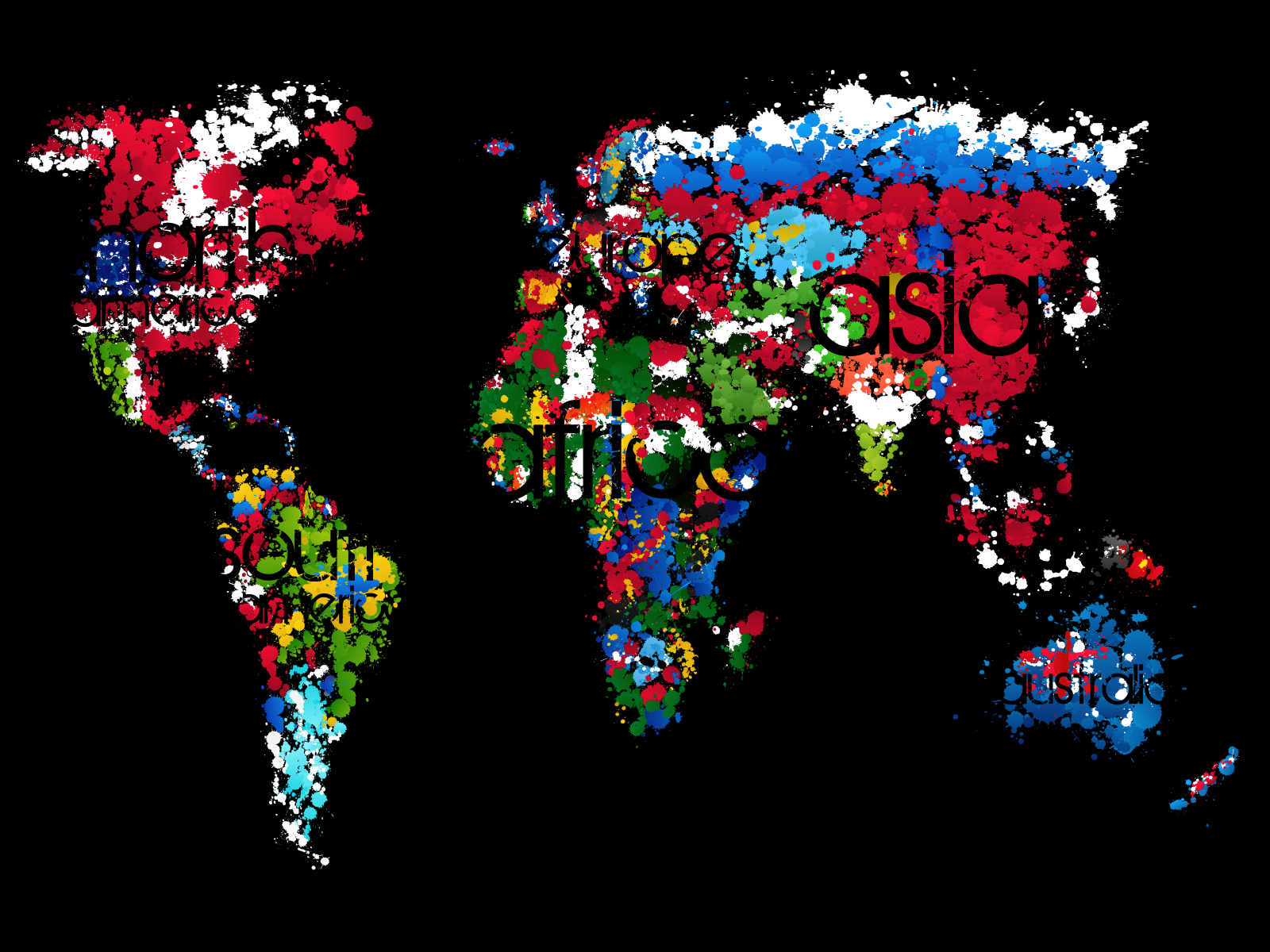
I picked this map because the cartographer used the type creatively by blending it in with the background to label the landmasses.
http://fc01.deviantart.net/fs36/i/2008/269/2/1/Let__s_Paint_Our_World_by_0ziriz.png
Tuesday, September 16, 2014

Thursday, September 11, 2014
Blog assignment #2

Richard Edes Harrison during World War II made this map in the perspective of a pilot. In the article I read, Harrison was an artist not a cartographer. I picked this map because I felt it was very interesting for that time period.
Source:
http://lincolnmullen.com/blog/map-projections-and-the-historical-imagination/
Tuesday, September 9, 2014

Thursday, August 28, 2014
Blog assignment #1
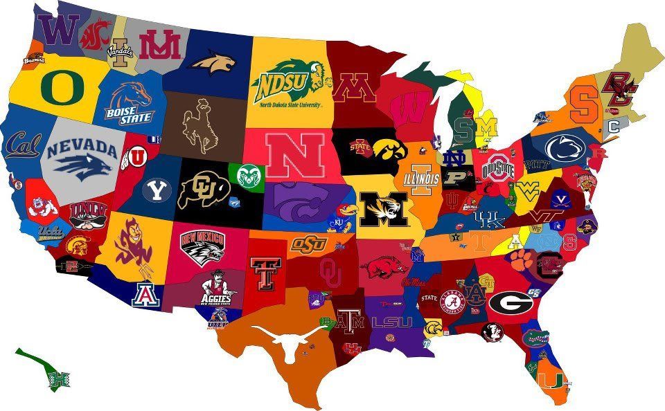
Fall 2013 college football fan base in the United States. Ready for football season to start!
https://blogger.googleusercontent.com/img/b/R29vZ2xl/AVvXsEjU5A1RZf7Pf2pDcAF2kp5EHS9o15PTwGwJxwb8PmgWbh7n_NrjJJKtmrOvPPd3mM2f5XIK2WZd7VdgHicrQYmjNiyHKw_xAE9GfmEsrRQO1BH2suzSPSFqQhVc0ko9DQ0ULjV8P_VCO_M/s1600/CFBMapIII.png
Subscribe to:
Comments (Atom)